正確無誤的畢業展
剛過去的週六,連長大雨,百無聊賴,神心地到了很 innovative 的 InnoCentre (小心,個 site 很嘈) 看 Poly 的 School of Design 的畢業展。
一進場,十分親切地看到一班看檔的同學們傳統地耍弄着撲克牌,應該正在「㩒 (kam2) 綿苔」。在綿苔檔旁是 Best of Show 的「精選作品」。逛了兩個圈,感覺良好,眾作品攤位都很 presentable,要有簡介有簡介,要有 project brief & background 有 project brief & background 加 rationale。儘管只是學生作品,但件件成品有板有眼,只要稍經專業從業執一執,不難推出本土市面,錢途可能無限。
InnoCentre 的地庫展廳寬敞光猛,沒有以往紅磚校舍如迷宮一樣的 visitor-unfriendly。 參展畢業生的作品琳琅滿目,絕大部份都是展出其獨一的「畢業 project」,十分孤注一擲。由美容廣告 campaign 到區域規劃 (保育課題較多) 都有,可用又實際,十分「professional」(唔講,以為去咗 HKDA 年展)。不論 BA (degree)、High Dip.、Associate (degree?!) 的水平,都很一致 ... ... 地好,如果不標明誰是誰,或統一了攤位的大小,真的令人難以分辨各門各派 ... ... 各等級各年期各學費價錢。
論地點,沒有人會懷疑不夠 innovative。
論參展者數目,沒有人會質疑康港沒有創意產業新血。
論 project 選材,沒有人會再投訴 Poly 畢業生只適合寫科幻小說。
論課程種類,沒有人會有志冇 Poly 讀。
論展覧本身,... ... 真的很啱,很完美。
... ... ... ... ... ...
看畢,外出仍在落狗屎。
不知從何處,跑了一隻鳥出來。
有朋友說,他 Poly 畢業了廿多年來,從未到過任何母校的畢業展。
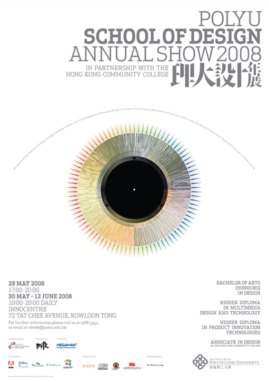
看來今後我都好應該像上面張 poster 般 —— 隻眼開,隻眼 ... ...
posted by 學子 @ 11:22 pm
12 comments
![]()


12 Comments:
Do you guys think this poster look too similar to the PRINT Regional Annual Book Cover 2007?
Actually I was thinking that The Eye very much reminds me of the UK Big Brother's logo! (Starting again this summer, sigh... why can't they just kill it!).
hey! totally different
all you can say is they look similar because they are all EYES
嚮門口"㩒綿苔"!? 無lecturer在場睇咩!?
學子講講下,我有D回憶以前嚮香港搞既grad. show,"綿苔"就無勒,politics就好特多......
To jomudyeah (what a great blogname!): It's not just the fact that they are eyes - the new BB logo deliberately changed to a rainbow colouring last year after the whole racism debacle, to show how it intended to celebrate diversity etc. etc. (Talk about a cosmetic makeover without any substance whatsoever). And the rainbow colouring is repeated also here in the iris.
Not that I'm insinuating that this poster actually copied BB's logo, afterall, the eye concept is really too simple / ubiquitous.
學子,咁係咪要黎個唔正確既黎比對比對?
http://www.medialogue.hk/2008/
Poster 個 main visual 似誰都不要緊,反正 visual 越簡單,撞的機會自然大。我倒關心的是 visual 本身想表達的究竟是甚麼?如果個 visual 屬常見料,但訊息若算幾特別嗰隻,厚道點,我都覺得不應狂插。閱畢畫面上的所有文字,「隻眼」和其彩色線條,究竟何解?!有幾特別?!有幾代表 Poly School of Design?!相信大家心中有數。
用眼嚟做主題講到底都算穩陣、貼題、冇犯錯。可能這多多少少代表了「不想犯錯,正正路路」的 Poly 新風格吧。
http://www.designsupremo.com/index.cfm?action=product.detail&department=art&product=a-b-peace-terror-etc--d0
嗱,咁都好似吖。
"如果個 visual 屬常見料,但訊息若算幾特別嗰隻,厚道點,我都覺得不應狂插。... 用眼嚟做主題講到底都算穩陣、貼題、冇犯錯。可能這多多少少代表了「不想犯錯,正正路路」的 Poly 新風格吧。"
Absolutely agree with the above. Please don't get me wrong, my comments above are not meant to 狂插 Poly U per se. For some reason it just struck me as close to BB's, but maybe this is more to do with the fact that over here we have been bombarded by the BB logo now since the new BB series this summer has started (I cannot believe how they manage to carry on after last year), and I've just seen "one eye" too many perhaps...
2007 Big Brother logo
http://www.eatock.com/project/e4-big-brother/
2008 Big Brother logo
http://www.eatock.com/project/big-brother-9-logo/
相比起 Poly 今云用眼做主圖,我覺得 Big Brother 所用的眼較顯得有紋有路。節目好睇與否難講,但據說節目概念來自 George Orwell 的 1984 中的「Big Brother is watching you!」。2007 的那着七彩用色刻意採用「電視色環」,恰當地呼應 Big Brother 是一個電視節目。不過,個 Execution 同個節目一樣,都不是我杯茶。
咁樣比一比,「Poly 眼」更覺空泛無力。(snowdrops,你說的都是。大家都沒狂。學子用詞誇張,失禮。哈!)
Thanks 學子 for your kind understanding :)
"據說節目概念來自 George Orwell 的 1984 中的「Big Brother is watching you!」。"
Yes, indeed, that was where the eye visual idea came from and why "the eye" is instantly recognisable as a BB logo.
"2007 的那着七彩用色刻意採用「電視色環」,恰當地呼應 Big Brother 是一個電視節目。"
This I would have to disagree, because BB started as a televised real-time 24/7 summer reality show
back in 2001 (or was it 2000?). Anyway, the rainbow colouring to the Eye was only unveiled AFTER the racist bullying involving the Bollywood star Shilpa Shetty last year, which caused international uproar. The rainbow colouring is part of BB's revamping of its image and more to do with embracing "diversity" and less to do with demonstrating that BB is a TV show (which everyone knew by then as it was in its 8 series):
http://www.encyclopedia.com/doc/1G1-163214897.html
"BIG Brother chiefs, desperate to distance themselves from the Shilpa Shetty race row, yesterday unveiled their new logo - a multicoloured eye.
Designer Daniel Eatock says his brief was to "embrace all colours within the spectrum, opposites, complimentaries and all shades in-between."
The revamp comes after Channel 4 chiefs were criticised for failing to protect Bollywood star Shilpa from racist bullying at the hands of Jade Goody..."
A clearer example of that eye logo is here (the link you've kindly included is the E4 version which added E4's customary purple splotches, the below link is the original logo sans the purple blotches):
http://www.eatock.com/project/big-brother-8/
I'm actually embarrassed now that I've revealed myself to know so much about this crap TV series!! Honest to god whatever I learnt of the series was more a result of pop culture references in the media over here and from the news when the racist bullying incident happened.
Oh I just clicked on the link that you gave in the previous comment from design supremo about the UN countries' role in peace and terror. That was really cool, thanks! And I agree also it looks very much like an eye as well!
I think you'd like this blog very much then which showcases great examples of elegant visualisations of data / information: http://infosthetics.com/
Such as this Diggs Stories history rings that look like age-old tree rings:
http://infosthetics.com/archives/2008/06/digg_rings.html
Oh I just realised that the peace vs terror poster is also mentioned on infosthetics!
http://infosthetics.com/archives/2008/05/peace_vs_error_infographic_poster.html
噢,原來那七彩背後有個如此「邪惡」的意圖,你唔講,我重以為只與電視色環*有關,謝謝你的解說。亦同情你對自己厭惡的事情有此等的參透。(我咪何嘗唔係?!如:康港設計文化、教育等)
{{ : )
(*不得不佩服 Eatock 的心思)
Post a Comment
<< Home