善哉 ... 善哉 ... ...
善哉。稱讚的感嘆辭。左傳,昭公十六年:「宣子曰:『善哉!子之言是。』」西遊記,第一回:「善哉!善哉!我等明日越嶺登山,廣尋些果品。」

冠軍作品。丹麥,Karsten SK Joldhoej。
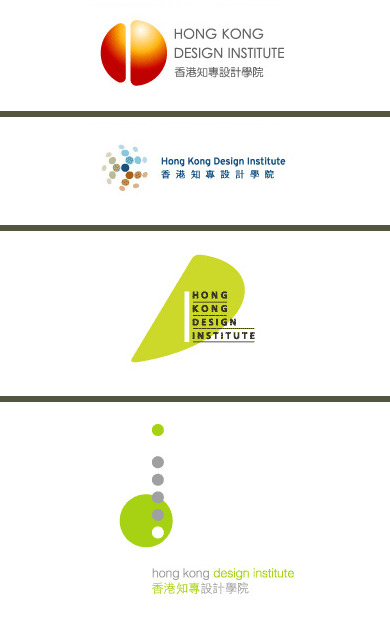
四件入圍作品。(由上至下,全部港產) 周昭武、楊樹浩、高少康、黃炳培。
厚道啲講,冠軍作品都唔係咁得人驚。冇驚嚇亦冇驚喜。肆肆正正,齊頭齊尾,好有 HKDA 撈稿嘅保守作風。例牌有中國元素至安樂,足以令評判一見鍾情。今時今日,作為一個撈稿,可以「死黑死白」,忍得住唔用漸變,已經值得高興。樣樣做啱、計算準確、內有玄機、㗳落有啲嘢、中英文有玩間字,絕不欺場 ... ... 完全體現學院嘅實幹、均真、有前途、出路佳嘅宗旨,一百分!冇得頂!
但係,始終覺得自己嗰個設計比較合適,至少夠直接、坦白、straight to the point,冇嗰份自吹自擂嘅「偽善」。
撈稿有了,即管就放長雙眼睇下日後啲 applications 如何。
posted by 學子 @ 9:28 pm
14 comments
![]()


14 Comments:
what a logo! 善哉!善哉!好大陸的設計(sorry)
學子's bowl logo is much much better ~ engaging and honest!
冠軍位仁兄係來自 denmark ,
有自己 design 公司 , 叫 designmind ~
叫 Karsten Skjoldhoej ~
無他架.. 幾 leung 都好 , 只要中對方口味就無所謂 -_-"
http://www.designmind.dk/
四名優異獎得主,除周昭武名字較陌生外,其餘三位均系出名門。楊樹浩,前 Lilian Tang 嘅 senior designer。高少康,應該仲喺 Kan & Lau 當 art director,係,冇錯,即評判之一劉小康之下屬。黃炳培,甚麼「又一山人」,唔駛講,正如佢自己話齋:「我你都唔識?!」
有啲咁嘅事~??!!唔知邊件係阿「又一山人」嘅「大作」呢...?!
又一山人?識佢老鼠!
又一山人咪就係整左個紅白藍 exhibition 果個人囉 ~
http://web.hku.hk:8400/~hkaa/hkaa/artists.php?artist_id=120
http://www.hkadc.org.hk/tc/infocentre/press/press_20050519
「又一刪人」嘅「大作」咪之唔係最下面最 Q 「瓦位」嗰個,阻住地球轉嘅「點點綠」撈稿囉!都唔明,幾廿歲人,仲做埋啲咁嘅浮誇、懶有 concept 嘢!
事實上我很喜歡學子那碗飯
如果可以分一口就好了
唓 ~~~ 原來咁多人 like 我隻「飯碗撈稿」,早知參賽啦!... ... 白白錯失咗個成名扑獎機會㖭!Sh ... ... ... it !
感謝各識貨之人!!!
{{ : )
老實講,我以前都同唔少美蓋組織做過野。之後,我可以大大聲講十個九個都係垃圾。我唔想畀稅囉!
Okay okay, maybe because it's my dirty mind, but the more I look at the first HK runner-up logo (the orange one) the more I think it somehow resembles a butt-crack??!! Like I'm staring at a ripe arse in the face? Do you know what I mean? Or is it really just me?
And how come the first two logos remind me of logos for telco companies rather than a design institute?
Can someone tell me also why the design institute's Chinese name has "Chi Chuen" in it?? What does "Chi Chuen" mean, is it some sort of a shorthand for knowledge speciality or some kind of indication of the sub-degree education level that its courses will be offering????
p.s. And yes "hardworking student" you should really have submitted yours to the competition - at the very least it would have given the awarding panel pause for thought when it comes to judging the winning entry as your design process would force them to re-think many preconceived notions about "good design".
now the HKDI logo looks very like a Chinese word.
If a clear word other than 知專is recognized, then the logo will be 7, superficial,naïve,年少氣盛…
If not a clear word can be recognized, then the logo will make ppl who know Chinese character confused, and then can’t sleep, can’t eat, can’t sit comfortably…
So, this logo just makes me sick.
They should hold the winning prize, and relaunch the competition, sth better and greater promotion should be rewarded.
「有啲心思,中西合璧,玩吓花臣,幾特別,努力過,outcome 幾靚仔,但基本上 meaningless」可能就係整個設計教育理念嘅中心所在 ... ...
Post a Comment
<< Home