龍咁威 2
姑勿論我哋鍾唔鍾意成龍大哥 (複姓成龍,名大哥,共四字),阿國際巨星都同我哋條「康港飛龍」(見下圖) 一樣,官方地代表住康港,係一個俾外國人睇嘅 icon。花咗近千萬公帑設計嘅「飛龍 campaign」,自幾年前 launch 咗到而家,雖然康港市民 (至少我) 仍然麻麻地知佢係乜,有乜用處,同 so far 有乜作為,但至少佢初頭都 make 到唔少 noise,引起過唔少「關注」,相比起董班子其他「堅嘢」,都算係咁嘞。
千萬金元巨型製作「康港飛龍」!


威威生猛「威爾斯體育飛龍 」!(1.5Mb PDF guidelines)
今日下晝,路過書室,揭一本 design 周刊時,忽然被一個圖像,勾起我萬千思鄉情懷。睇真,原來個圖像完全唔關康港事,係「威爾斯康體局」(Sports Council for Wales) 嘅撈稿至真!(見上圖) 吖 ~~~ 鬼整佢同我哋個「飛龍撈稿」咁鬼似!唔通政府俾成千萬,買咗件「A 貨」?!
經一輪網上調查,有驚人發現!原來條「威爾斯體育飛龍 」應該大約喺二零零五年至開始採用 (參照 guidlines 嘅日期),而我哋條「康港飛龍」則遠於二零零一年五月十號已喺《財富》時代論壇搶閘推出,仲係「廣為大眾接受」咁話 (政府一講到設計就最「民主」)。咦?!照咁睇嚟,今次可能係人哋「參考」我哋喎!無論概念、造型、supporting graphics、龍嘅頭仔、眼仔、嘴仔,都成個餅印。嚇!呢次仲唔一吐一直以來《香港好相似設計》對康港抄襲風氣指控嘅烏氣!!!
可能有人會話:「嘩,我哋條飛龍咁鬼肉酸,班鬼佬咁都抄,唔係 fa?」哈哈,呢個世界就係咁無奇不有,更何況,審美呢家嘢真係好難講,如果「美」係有絕對定意或標準嘅話,就唔會有咁鬼多人睇到啲核鬼突減肥 ad,隆胸 ad,都舂個頭埋去貼錢整醜自己啦!
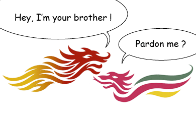
唔只遙遠嘅東方有條龍,原來遙遠嘅西方都有一條差唔多嘅。
posted by 學子 @ 6:55 am
8 comments
![]()


8 Comments:
強烈要求張呢單嘢擺上天堂~!!!核突嘢都有人抄,仲要係大英帝國,猛料~!!!
真係好自豪!乜嘢信心都返晒嚟!
they use the same font !
is it possible that they are done by the same design firm ?
又唔係完全一樣嘅 ~ 。「港飛龍」係用 Frutiger (primary) 同 Eurostile (secondary),而「威爾龍」就用 Syntax (corporate) 同 Frutiger (secondary),都算有啲「心思」㗎。
係咪同一間做,就真係唔肯定 (無證無據)。據知,「港飛龍」係 Landor (HK) 手筆。但照兩份 guidelines 嘅質素睇嚟,「威爾龍」唔似大公司製作。我懷疑,一係 freelance 抄嘢 case,一係舊員工「秘撈」之作,一係個客要求照 dup,總之唔似花咗好多錢嗰隻。
反而想知才子見到會點寫....「亞洲國際都會只係等如大不列顛國的一個小小Sports Council」,然後繼續之前三年每日重複既果個point....再寫足一個星期.....
呢單係康港嘅威水嘢,大英嘅羞家嘢,才子應該未必感興趣狂寫呢!
你會咪話,如果冇呢條「威龍」,都唔覺我哋條「港龍」啲 curve 位,原來都 curve 得唔錯。
Thanks for this hilarious post! I almost choked on my tea when I saw your "pardon me" talk-bubble :D!!!
I guess by 才子 you guys meant "To Git" right? Oh that man does my head in!! I saw an episode of his Britain travel documentary and the amount of misinformation contained therein made me furious that he dared to style himself as 才子!!! He also mentioned the Welsh dragon in his show about Wales actually but its appearance and adoption by the Welsh wasn't as recent as he suggested.
Anyway, concur wholeheartedly with your opinion that the ugly HK Dragon symbol (I can't believe they used gradient fill! And of such "leung" colours as yellow and red! And with so much extraneous details!) doesn't look so bad when compared with the Welsh one... We might not look the best and we might not be unique (because of the existence of the other dragon) but at least we're accepted (again because of the existence of the other dragon). Lucky us eh?
原來西方龍條利係分開 , 成支丫叉咁架..
乜唔係蝦李波突果 d 火龍咁 , 有 4隻腳既咩 @@"?
但始終我都係覺得本地飛龍唔得.. ...
Post a Comment
<< Home