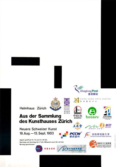
Leaflet-poster
在資訊氾濫視覺污染嚴重的康港,不知大家有否留意,環顧四周身邊的海報,跟一張放大了的 leaflet 冇乜分別。字數往往至少一百幾十字,內容應有盡有,愛閱讀文字的朋友,定必愛死。一般海報,除主要圖像(main visual)、短小宣傳句語(tagline)、機構撈稿外,少不了的,總有:
詳盡聯絡方法
當中包括 URL、email address、電話號碼、傳真號碼、郵寄地址、接洽人物(如陳先生、黃小姐等)、地圖、巴士地鐵路線等。總之蕩失路都唔駛驚嗰隻。
產品/活動簡介
當中包括賣點、威水史(曾獲獎項或曾接受傳媒採訪評級等)、圖解、用法、用前用後效果、ISO9001234567等。
贊助商撈稿
形狀奇特五花八門樣樣有不在話下,還要指定顏色(最好彩色。單色黑或反白會令客戶麻麻地高興),甚至堅持撈稿背景顏色,或硬加上長方形白地托底,相當霸道。不論個撈稿有幾樣衰質素低,size 都越大越好,完全唔怕醜。
一張空間有限的海報,把上述所有「重要的」information 都塞進去,同時,又要「靚」,實在是千千萬萬康港切雞屍的夢魘。想問問,究竟有幾多人會在街頭駐足細閱一張內容如斯豐富的 leaflet-poster 呢?而 poster 呢樣嘢,(除 size、傳遞方式外)究竟又同 leaflet 有乜分別呢?今時今日上網尋找資訊易如反掌,有話一定要喺海報上說盡麼?!
兩年半前 quote 過以下一段 Josef Müller-Brockmann《History of the Poster》(1971) 的文字,今日再讀,感受更深,感慨良多。
Posters are barometers of social, economic, political, and cultural events, as well as mirrors of our everyday lives.
The task of the poster should not, however, be limited to mere communication between producer and consumer, but should also improve the aesthetic sense of its viewers, thereby making a contribution to their artistic awareness and their awareness of their follow human beings. The poster, which nowadays is present everywhere, has long been an important element forming our environment.難道康港的日常應用海報永遠注定醜怪低俗,要做好嘢優質嘢就只好參加每三年一次的「自娛性海報展」?!

Brockmann 大師,有怪莫怪,細佬只係有感深受你建構主義影嚮,不能自拔,身處康港庸俗大染缸,任我扭盡六壬精雕細琢,最後大多難逃「visual junk」的污染,真無奈兼氣頂!特借貴海報發一發洩,相信如果你係我,你都共鳴。


9 Comments:
我覺得放logo唔係問題......問題是有無必要下下都要雞乸咁大呢下至氣頂!更誇張的係試過有客話要連sponsor既簡介都擺埋落去...
聯絡方法要放沒問題,我都覺得應該要放...但係有無用下個腦諗下要擺乜呢?fax no??貼黎等人send廣告??交通路線地圖就變成了主辦機構對於個event既重視程度啦,因為十有八九唔係印錯就係有等如無...最正既係我唔只一次見過,真係有地圖畫左出黎,仲會有段字寫埋教你嚮邊度落左車再點點點行bla bla bla.....
我唔反對將一D需要駐足細閱的內容放得細D,亦都覺得有D information放左都無壞。但係學子提及咁多"重要的"information有幾多真係要放到鬼咁大,各位看倌心照。實際要求你做而又俾唔出理由的理由,往往是一句"PR策略"大晒。
我係真係有D好奇,PR學上有哪裡教過這門子事情...
"Leaflet-poster"
實在講得太好!
早排遠距離咁幫香港一個環保機構義工價地設計張Poster,差不多做到尾o個陣時,佢地負責人先send左一堆文字要我放上去,仲唔係細細粒字呀!!! 又同唔到佢地當口當面理論(我人不在港),最後合埋眼咁幫佢地整出黎,但講明呢次會係最後一次幫佢地設計!!! 我當時都有好嬲咁問佢地 : 究竟你地而家係要leaflet定poster呀?!?!?!?!?!
見到上面張poster真係心痛...
What happens is for instance when you see a nice clean poster in the UK all you needed to do is to pick out one or two keywords from the poster. (Company name, slogan etc.) Get home and google it, you'll find all the info right there, fully explained plus all the rest of the related press coverage from Times/other review/critics web site about the content of the poster. Even for sponsors if you're that interested, the logo links would direct you to their fully cooked, up-to-dated web site.
What happens in HK is that when you see these posters, try and go on the web site, very often it is the exact same poster again on the screen. Most of the sponsor's web site are either not working or having no less than a bunch of flash. So to cut the shit for everyone (in their opinion) why not just stuff everything on the poster then to waste everyone elses' time/money to get their own company's ad campaign, web site, brand image right?
I think this is a logical/economical explanation to why they are crap.
香港的baby boomers 真係唔鍾意上網,一來佢地開始老花,二來不嬲唔相信d "high-tech"野,甚至以為web 2.0係一隻software
通常呢班人係PR/Marketing掌握重要位置,或者佢地係客。
總之一張海報入面有d乜,好大部份都係呢個age group既人諗出黎,講真,3,40歲以下既人,有條link已經可以做到好多野。
查實最好應該開seminar,俾d marketing/PR 學生體會一下
整十張「港式豐滿海報」在佢地面前揚過,每張show 3秒,然後問佢第四張海報講乜,我諗無人會答到出黎。
再講返十張歐美日的簡潔海報,用同樣時間,對比就會好明顯。
無法子…
有冇睇過
Art Lebedev入面Mandership
有一篇講 Letterhead的故事?
http://www.artlebedev.com/mandership/102/
真從好直接。
http://ffffound.com/image/63f8a44003875281b3f1b3644237a34b1f0f9ca9
This is poster.
Simon
貪心,無常識,成日要大什會,怕落漏野要 "mei wok", that's why you could see so many leaflet poster, especially from the government authority -__- 無奈~
我惗主要係啲人都當「but should also improve the aesthetic sense of its viewers, thereby making a contribution to their artistic awareness and their awareness of their follow human beings.」呢句嘢死嘅之故。對康港人嚟講,句嘢太深,責任太沉重,都係賣嘢、收錢、食飯、痾屎較要緊。
再加上,甚麼「萬一」「之前試過」「大眾唔係 designer」之類嘅「假設性鐵證」support,張海報想簡潔精妙都難。
「萬一啲人唔識嚟點先?加個地圖穩陣喎。」
「一於 bilingual 啦,萬一啲人唔識睇事但一種文都明嘛。最好 trilingual,不過可能會太多字...」
「萬一個贊助炸形點算,都係放大啲佢個 logo 先啦。記住彩色。」
「之前試過齋落 URL 啦,結果好多人話唔夠方便,今次落埋電話、fax、地址、email 啦。」
「之前試過簡潔啦,啲人話悶喎。」
「之前試過淨 visual 加 logo 啦,結果冇人明,今次都係詳細啲好。」
「哎喲,我知你想點,但受眾唔係 designer 嘛,哪會明你呢啲藝術嘢。我就明啫。」... ...
再再加上,根本唔信你,或,根本當你係切稿佬,任你再能言善辯,到最後都係唯有... ...做啦!
吖,若果康港市民大眾真係蠢啲,懶啲,頓啲,理解能力差啲, 咁,leaflet-poster 的確有佢存在價值呢!
黑人:
佢地分分鐘同你反駁,話幾秒鐘唔夠,要一分鐘至fair架XD
學子:
慘得過身邊既人嚮呢堆對於他們來說毫不關心的事情上真係會忽然變身做天真嬌,自認自己好天真好傻又樂此不疲?
Post a Comment
<< Home