24.5.09

Plain Text 看文化


今次不打算討論甚麼設計。

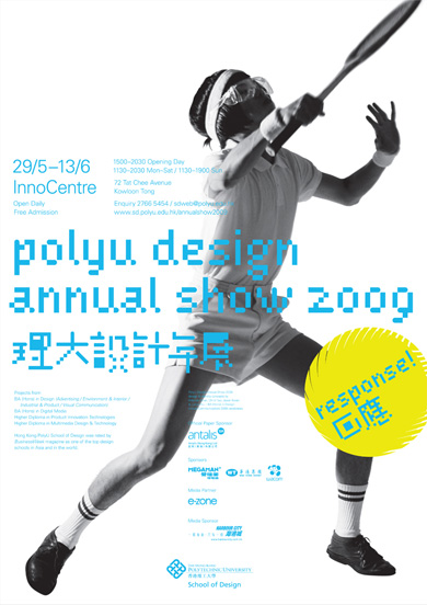
以上兩張海報,減去設計,剩下來的 Plain Text,比其設計,有趣得多。
Central Saint Martins Degree Shows 2009
17 June – 4 July
for details visit
www.csm.arts.ac.uk

[University of the Arts London logo]
[Registered Museum logo]
[CSM 20th Anniversity logo]
[Designers and photographer credit]
PolyU Design Annual Show 2009 理大設計年展
Response 回應

29/5–13/6 InnoCentre
1500–2030 Opening Day
1130–2030 Mon–Sat / 1130–1900 Sun
72 Tat Chee Avenue Kowloon Tong
Open Daily
Free Admission
Enquiry 2766 5454 / sdweb@polyu.edu.hk
www.sd.polyu.edu.hk/annualshow2009

Projects from
BA (Hons) in Design (Advertising / Environment & Interior / Industrial & Product / Visual Communication)
BA (Hons) in Digital Media
Higher Diploma in Product Innovation Technologies
Higher Diploma in Multimedia Design & Technology

Hong Kong PolyU School of Design was rated by BusinessWeek magazine as one of the top design schools in Asia and in the world

[Designers credit]
[Sponsor logos] x 6
[PolyU School of Design logo]
問題:
聖馬丁不怕大眾上不了網,因而錯過其展覽嗎?
還是,聖馬丁已經夠知名了,有本錢擺出一個「嚟就嚟,唔嚟就罷」的姿態?
若果理大仿效聖馬丁的「言簡意賅」做法,會流失懶上網的「potential audience」嗎?
理大海報現在的「資訊體貼」會為個 show 帶來更多人流嗎?
文字數量和語調是否海報設計中的重要元素呢?
海報內容字數的多少,究竟誰來定?
為甚麼聖馬丁無乜 sponsor?
這兩張海報的設計者是該校的學生/畢業生?
「言簡意賅」不一定是好海報,「資訊體貼」又一定是差海報嗎?

... ...

惗極唔明。
16.5.09

Leaflet-poster

在資訊氾濫視覺污染嚴重的康港,不知大家有否留意,環顧四周身邊的海報,跟一張放大了的 leaflet 冇乜分別。字數往往至少一百幾十字,內容應有盡有,愛閱讀文字的朋友,定必愛死。一般海報,除主要圖像(main visual)、短小宣傳句語(tagline)、機構撈稿外,少不了的,總有:

詳盡聯絡方法
當中包括 URL、email address、電話號碼、傳真號碼、郵寄地址、接洽人物(如陳先生、黃小姐等)、地圖、巴士地鐵路線等。總之蕩失路都唔駛驚嗰隻。

產品/活動簡介
當中包括賣點、威水史(曾獲獎項或曾接受傳媒採訪評級等)、圖解、用法、用前用後效果、ISO9001234567等。

贊助商撈稿
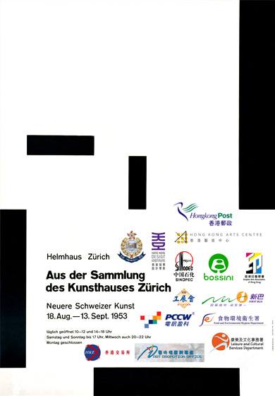
形狀奇特五花八門樣樣有不在話下,還要指定顏色(最好彩色。單色黑或反白會令客戶麻麻地高興),甚至堅持撈稿背景顏色,或硬加上長方形白地托底,相當霸道。不論個撈稿有幾樣衰質素低,size 都越大越好,完全唔怕醜。

一張空間有限的海報,把上述所有「重要的」information 都塞進去,同時,又要「靚」,實在是千千萬萬康港切雞屍的夢魘。想問問,究竟有幾多人會在街頭駐足細閱一張內容如斯豐富的 leaflet-poster 呢?而 poster 呢樣嘢,(除 size、傳遞方式外)究竟又同 leaflet 有乜分別呢?今時今日上網尋找資訊易如反掌,有話一定要喺海報上說盡麼?!

兩年半前 quote 過以下一段 Josef Müller-Brockmann《History of the Poster》(1971) 的文字,今日再讀,感受更深,感慨良多。
Posters are barometers of social, economic, political, and cultural events, as well as mirrors of our everyday lives.
The task of the poster should not, however, be limited to mere communication between producer and consumer, but should also improve the aesthetic sense of its viewers, thereby making a contribution to their artistic awareness and their awareness of their follow human beings. The poster, which nowadays is present everywhere, has long been an important element forming our environment.
難道康港的日常應用海報永遠注定醜怪低俗,要做好嘢優質嘢就只好參加每三年一次的「自娛性海報展」?!


Brockmann 大師,有怪莫怪,細佬只係有感深受你建構主義影嚮,不能自拔,身處康港庸俗大染缸,任我扭盡六壬精雕細琢,最後大多難逃「visual junk」的污染,真無奈兼氣頂!特借貴海報發一發洩,相信如果你係我,你都共鳴。

6.5.09

大麻背心包山王


相關新聞